
VCLA Logo Development –
Complete Rebrand
The Valley Community Learning Association (VCLA) wanted a modern, meaningful logo and brand identity that reflects their mission of supporting lifelong learning. While their previous logo used fiddleheads, VCLA asked for a fresh design built from the ground up. I created a new logo inspired by the symbolism of ferns, growth, and learning—captured through a refined, contemporary illustration and a cohesive visual identity system.
PROJECT OVERVIEW
VCLA is a community organization dedicated to helping individuals learn, grow, and build brighter futures. They needed a visually strong, versatile identity that connects to their values of growth, resilience, community, and lifelong learning.
My Role: Logo Designer & Brand Developer
Tools Used: Illustrator, InDesign, Canva
Scope: Logo design from scratch, brand identity system, colours, typography, templates
CONCEPT & SYMBOLISM
The new logo was built around the idea of growth through learning. Inspired by ferns and fiddleheads in various stages of unfolding, the design represents:
-
New beginnings
-
Continuous learning
-
Individual growth paths
-
Strength and resilience
The ferns emerge from an open book, a symbol of knowledge, support, and opportunity.
The upward movement of the fern shapes reflects VCLA’s mission: Learn. Dream. Grow.
Fiddleheads—Ma’susi’l in Mi’kmaq culture—also symbolize renewal and community connection. The final design respectfully acknowledges this cultural significance.

WHERE THE CONCEPT BECOMES REALITY
The completed logo captures the heart of VCLA’s mission: supporting individuals as they learn, grow, and build new possibilities. The fern rising from the open book symbolizes new beginnings, resilience, and the unfolding journey of education. Soft curves and balanced spacing create a sense of calm and encouragement, while the strong line work ensures durability across all applications. This final logo honors the organization’s roots while offering a refreshed visual identity that will serve them well in the years ahead.
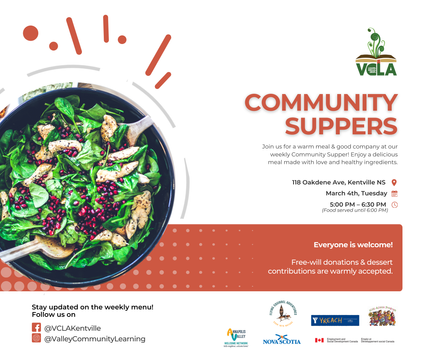
The redesigned VCLA brand identity brings clarity, meaning, and a modern visual approach to a community-focused organization. Along with creating a new fern-and-book logo, I developed a cohesive visual system including a refined typography hierarchy, a tonal colour palette built from VCLA’s primary colours, and practical brand applications such as print materials, posters, social media templates, and signage. I also created a complete brand kit outlining logo rules, colour usage, typography, spacing, and layout guidelines to ensure consistency across all communication platforms. This comprehensive identity system supports VCLA’s mission and strengthens their presence across both digital and print environments.


